New Mexico Department of Health Brand

The Story
The New Mexico Department of Health needed updated branding that represented a respected organization, but also felt approachable and accessible.
The logo mark was one of the first challenges. What was the best way to represent the public health department for New Mexico?
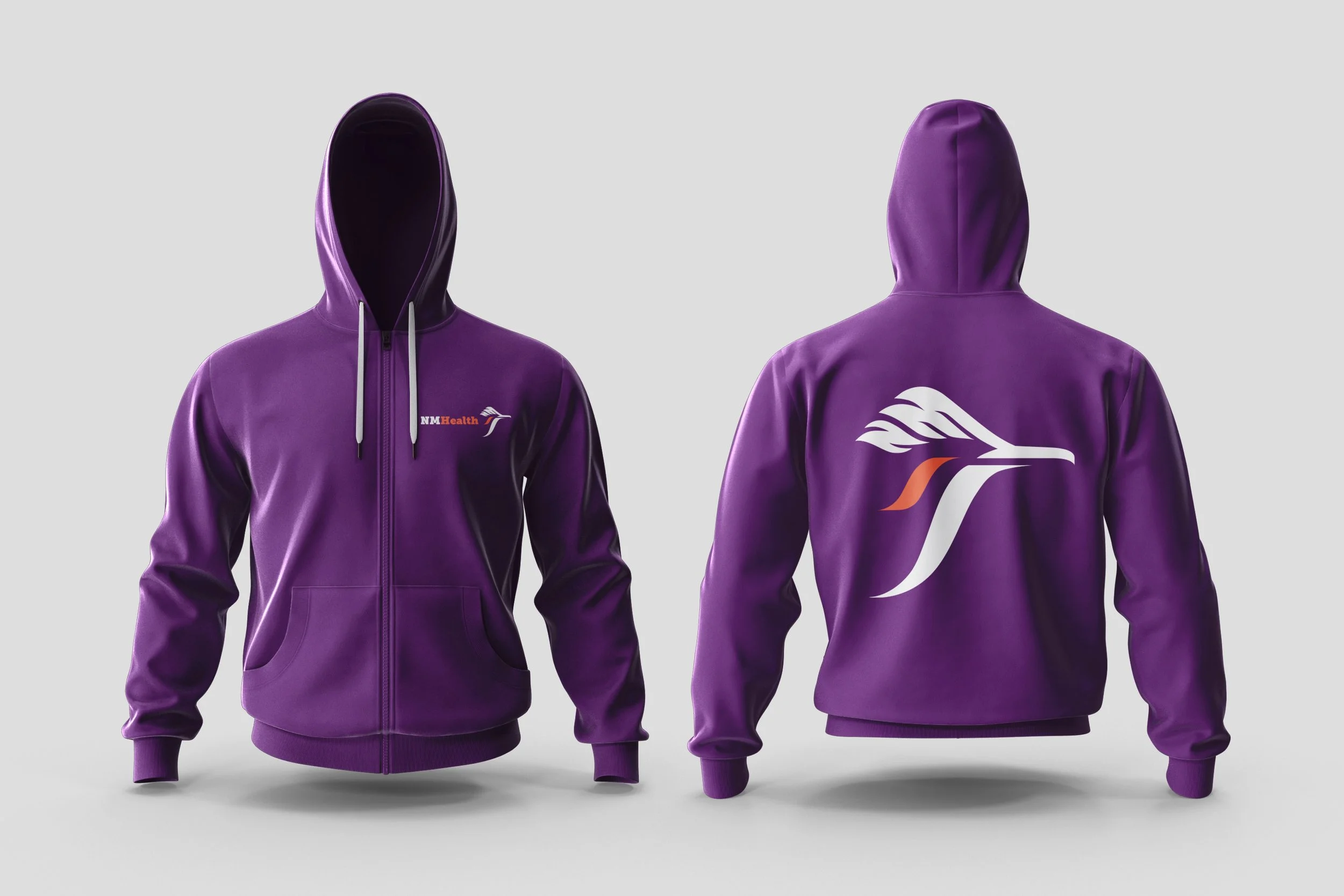
We chose the roadrunner, the state bird. Combined with the symbol are mountains, a valley and a river. The mountains are also shaped into "NM" while the tilde-shaped river represents the pop of color on a roadrunner's cheek.
The roadrunner is a symbol within multiple Native communities in the state like the Hopi Pueblo. They are medicinal creatures that ward off evil spirits, making it an ideal symbol for the health department of New Mexico. The logo mark was changed for brand launch at discretion of the cabinet secretary, but all other elements stayed in-tact.
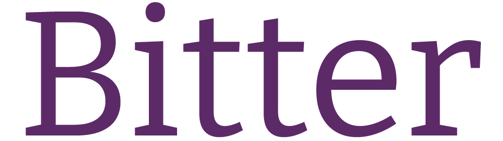

The font pairing, Bitter and Manrope, balance legibility, professionalism, and friendliness, while being open source fonts from Google, making them accessible to all staff.
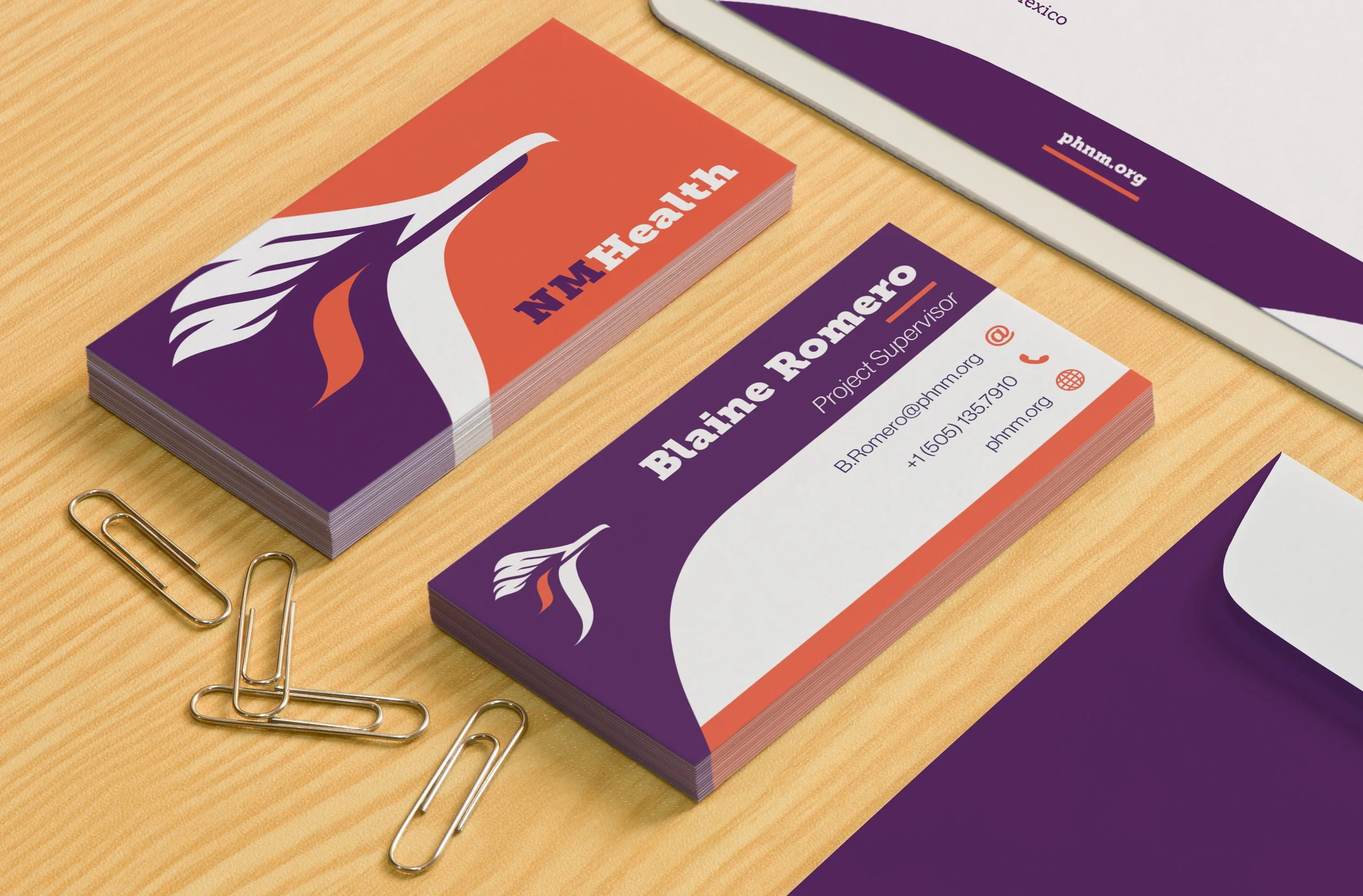
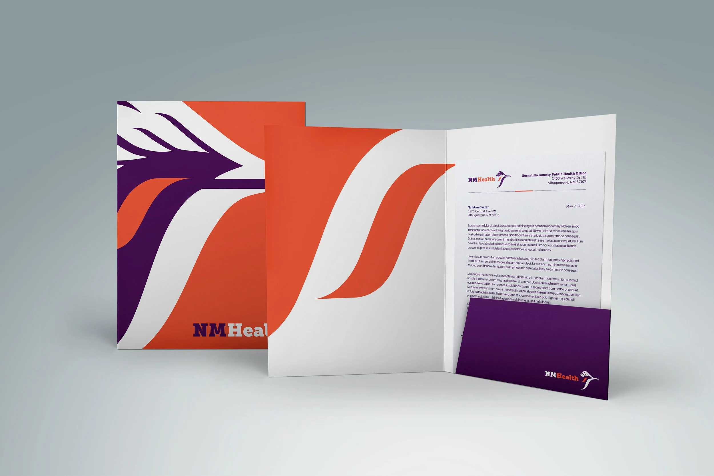
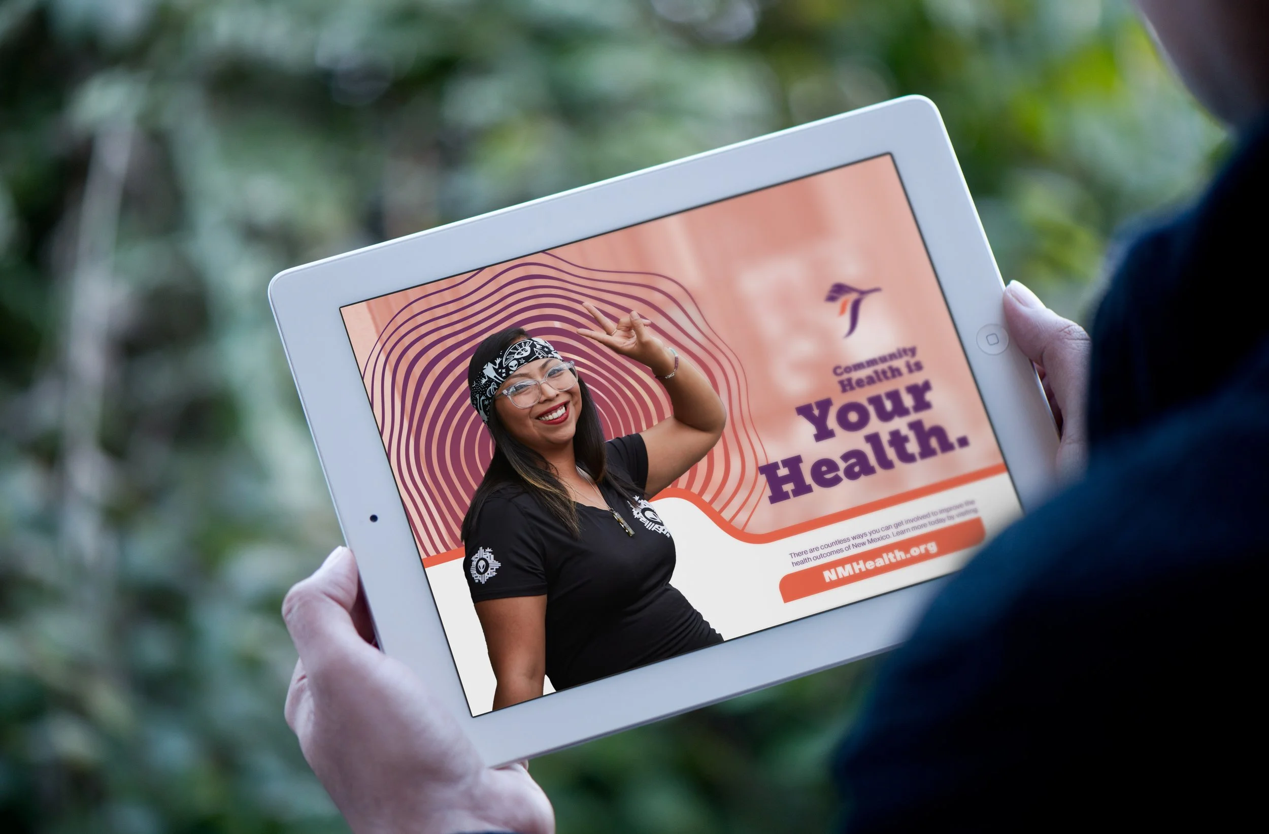
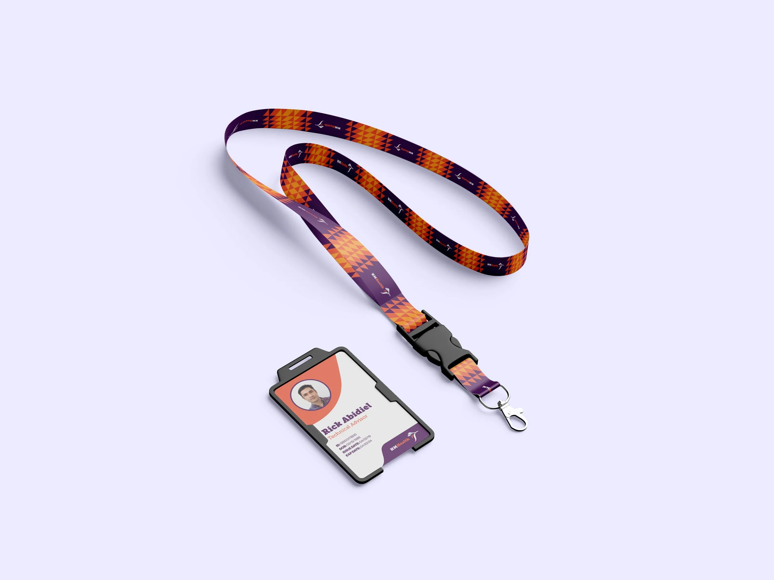
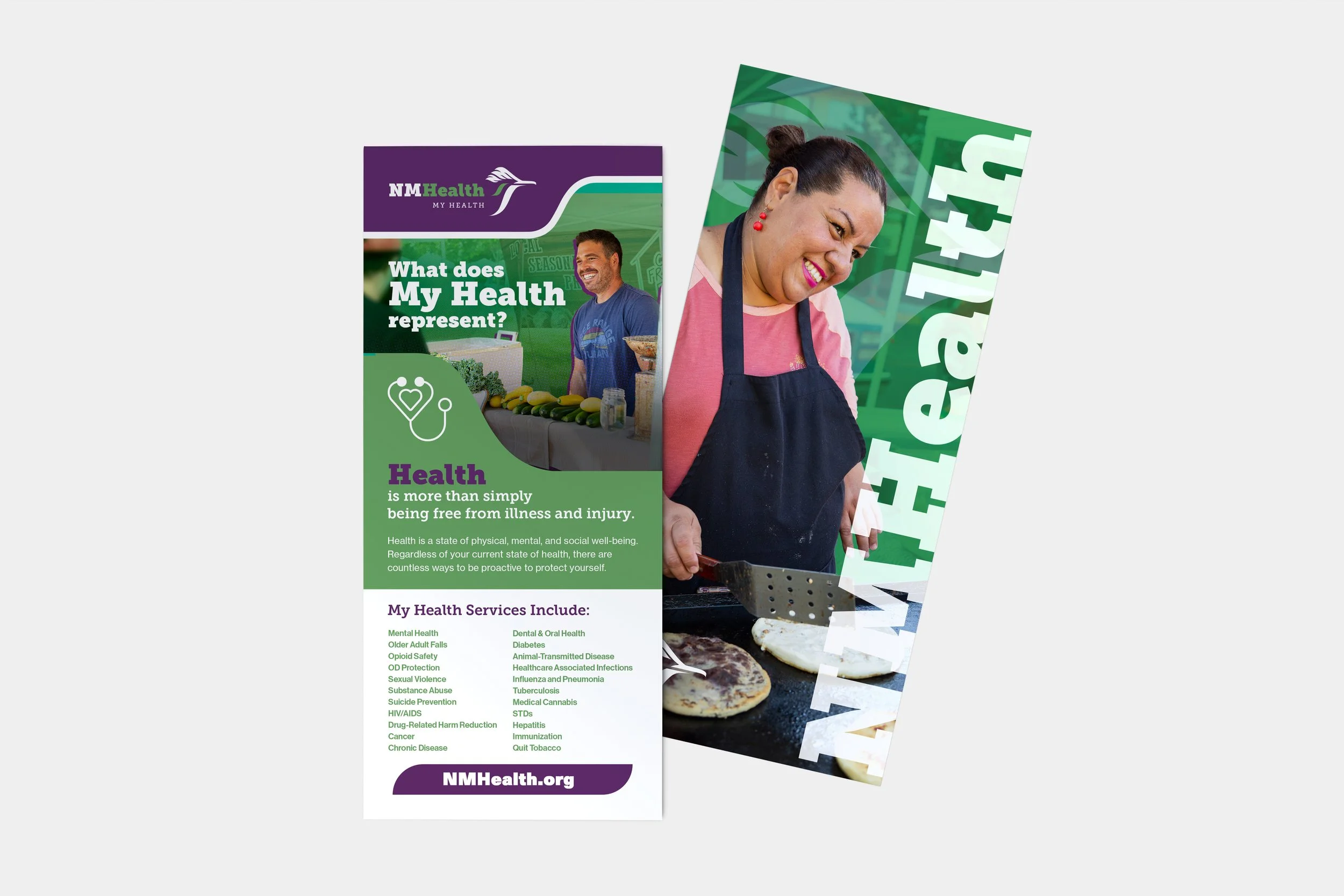
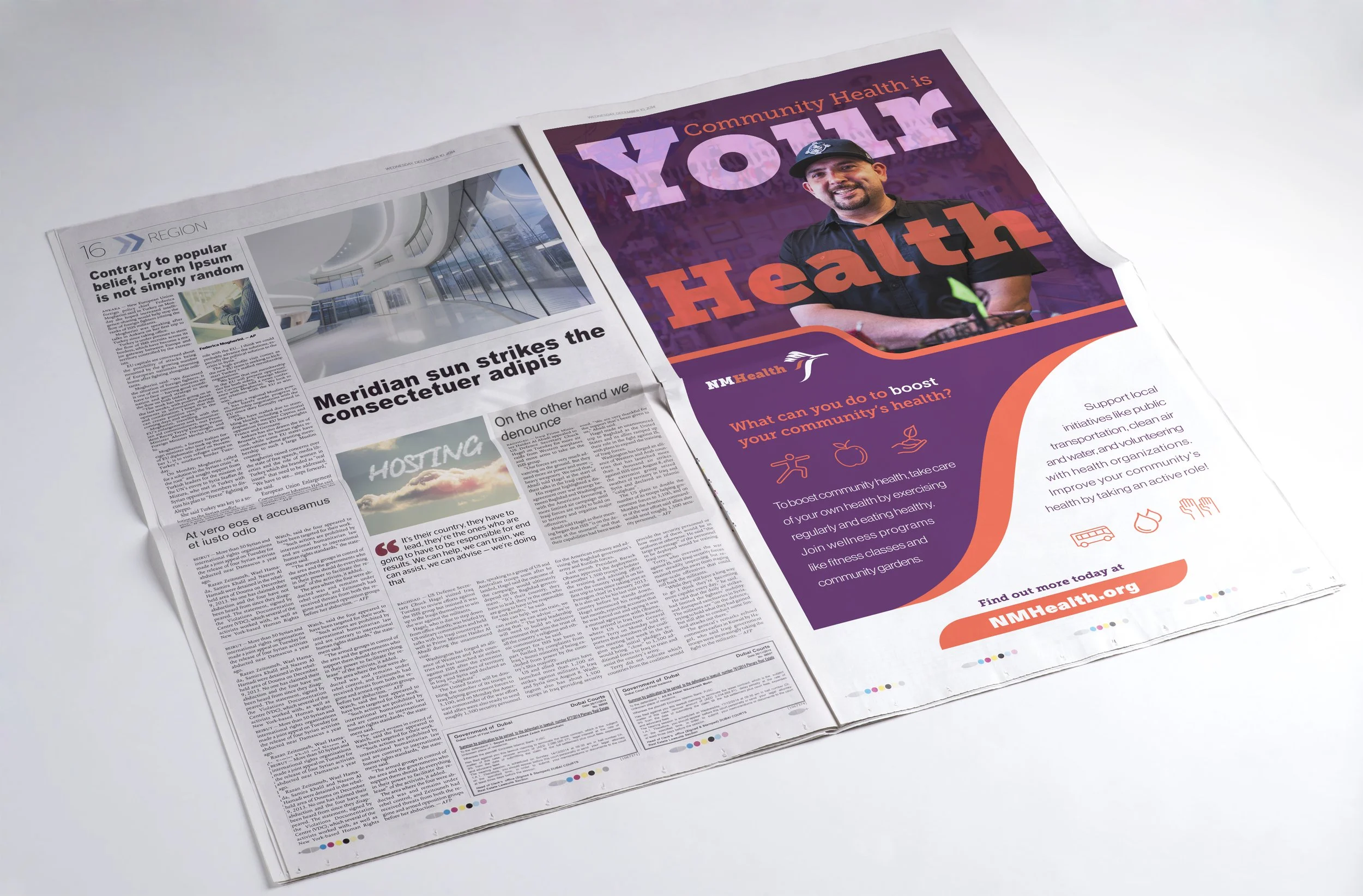
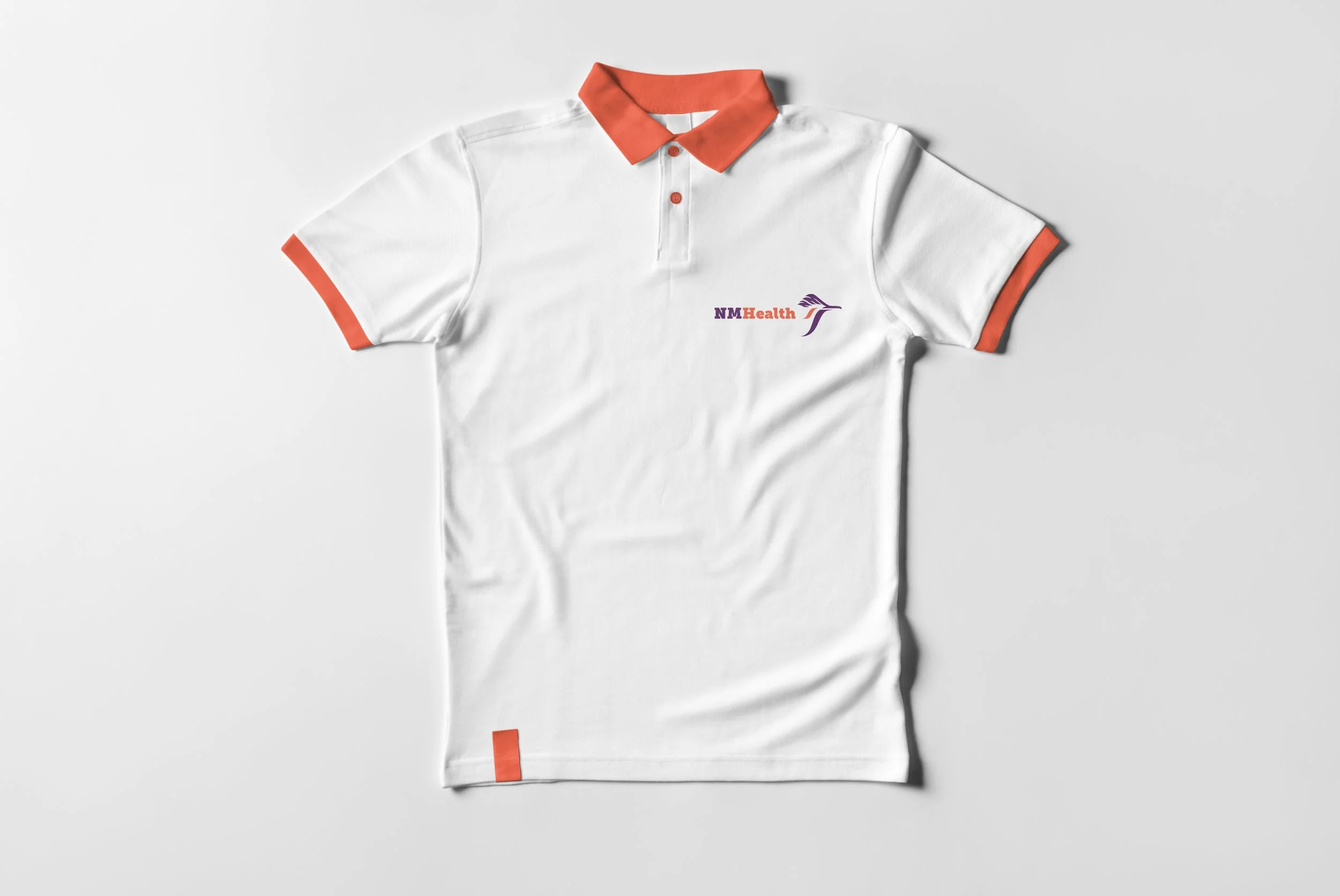
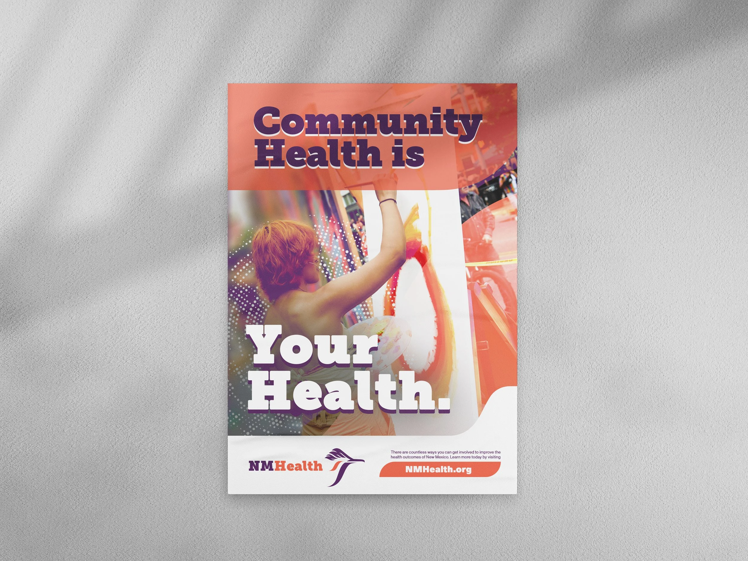
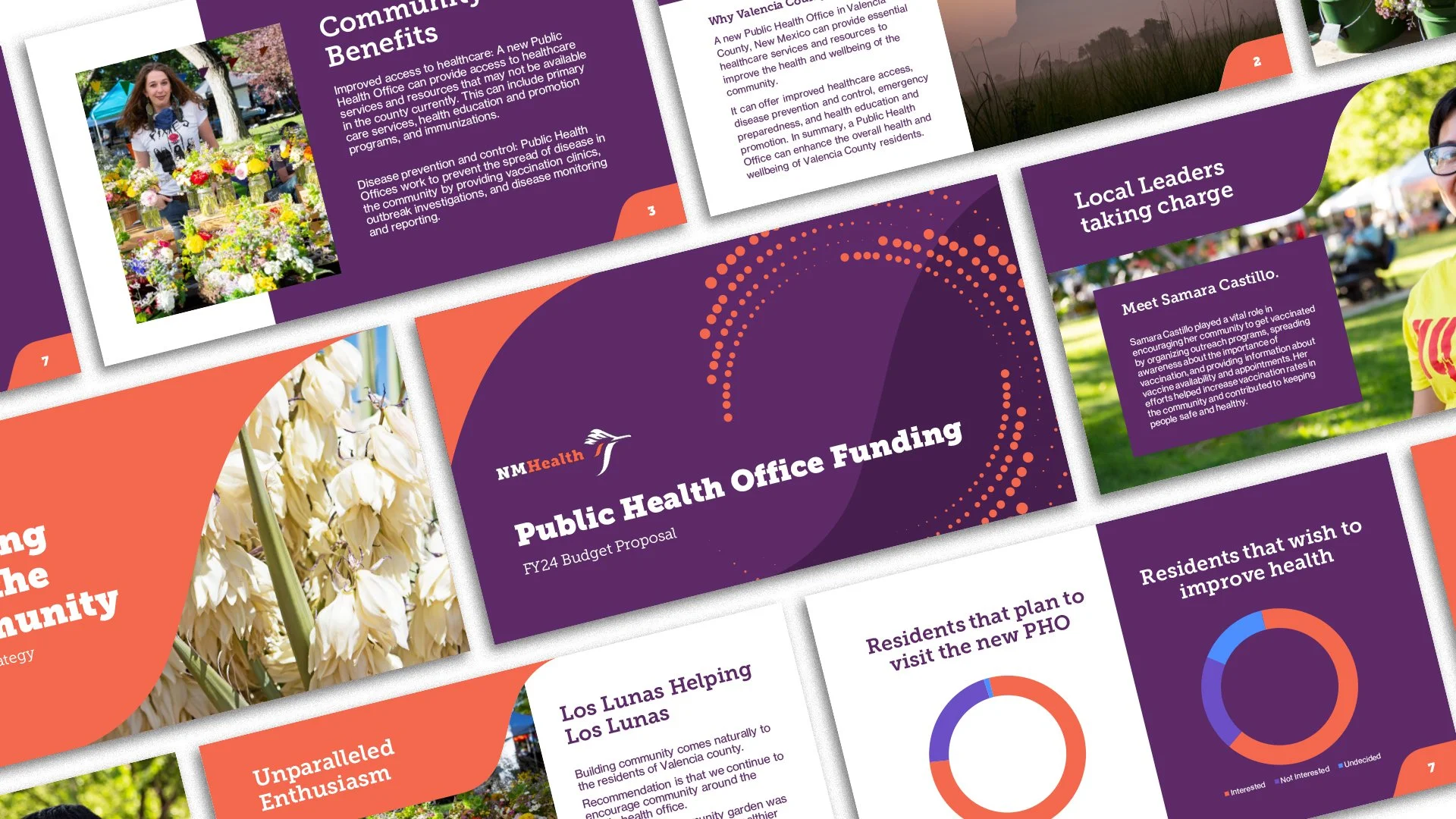
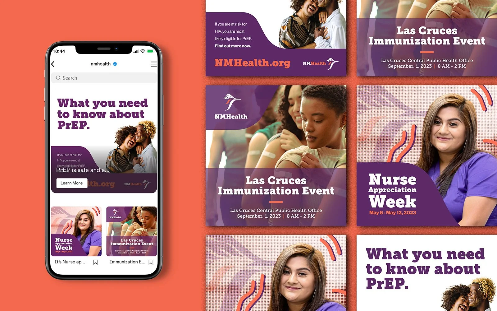
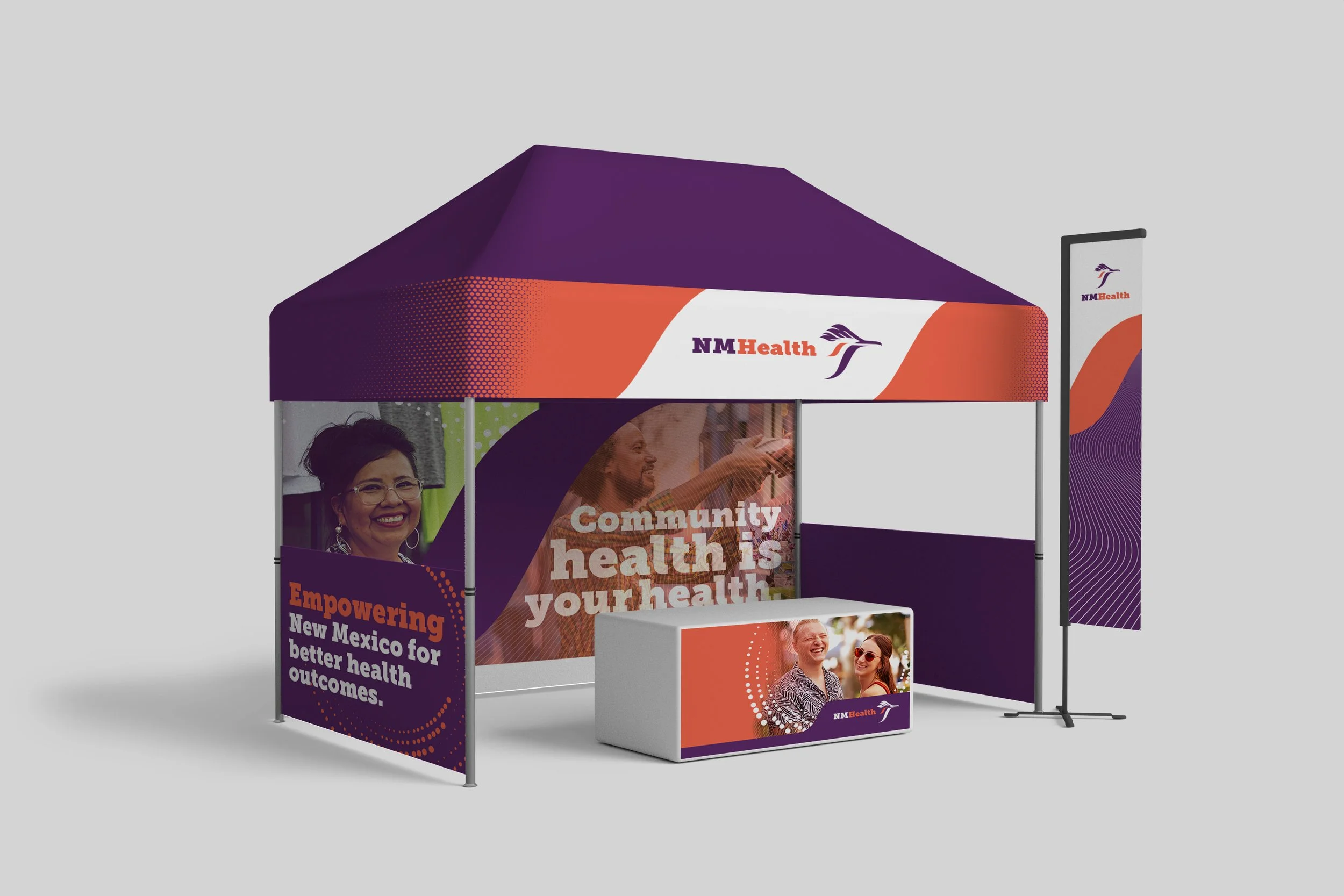
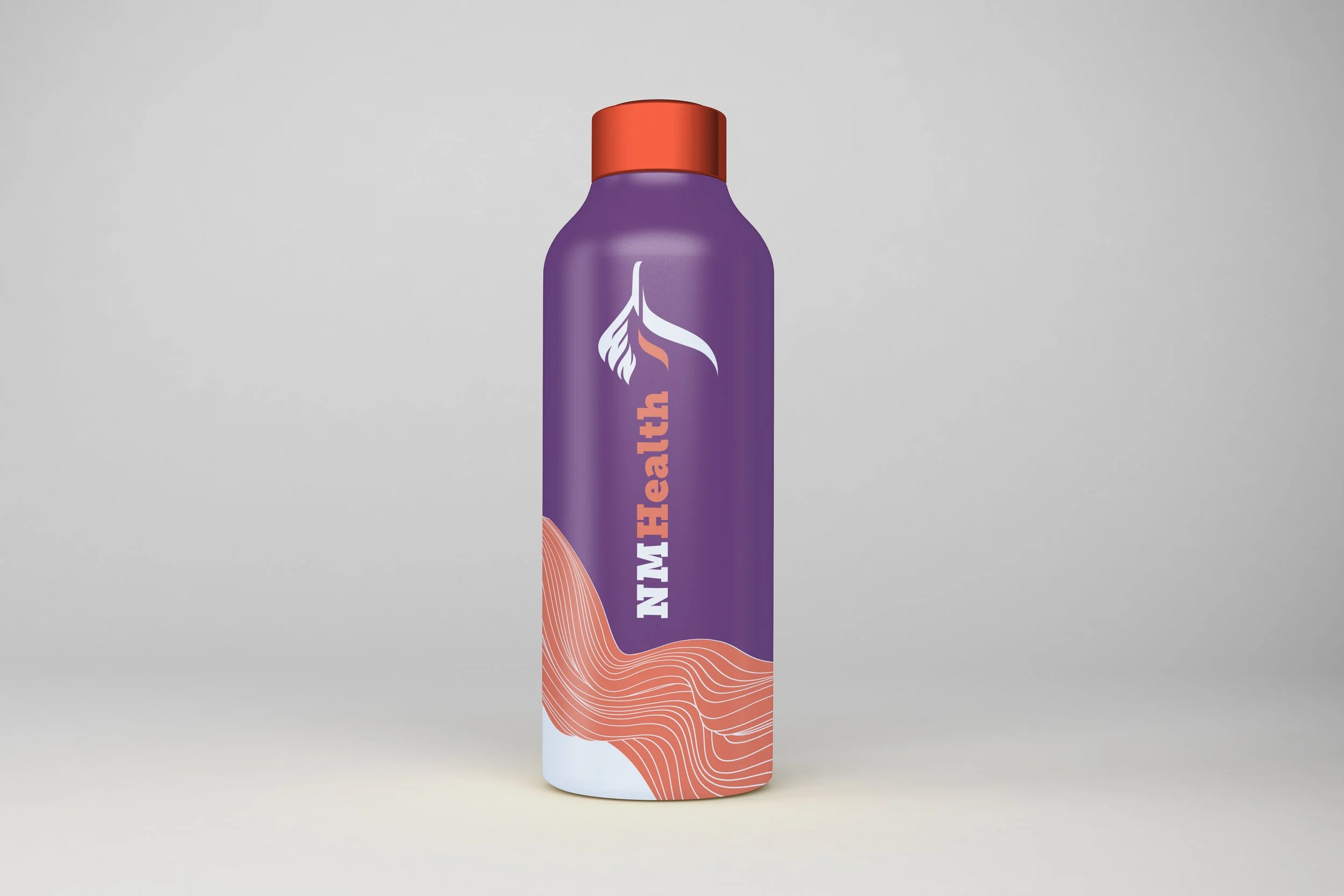
Initially, the font pairing was Museo Slab and Akzidenz-Grotesk, visible in the brand mock-ups below. The fonts were adjusted prior to launch in favor of Bitter and Manrope, which ultimately increased font availability within the agency. These two fonts have provided flexibility in tone and are consistent with the goal of the branding: approachable and accessible.
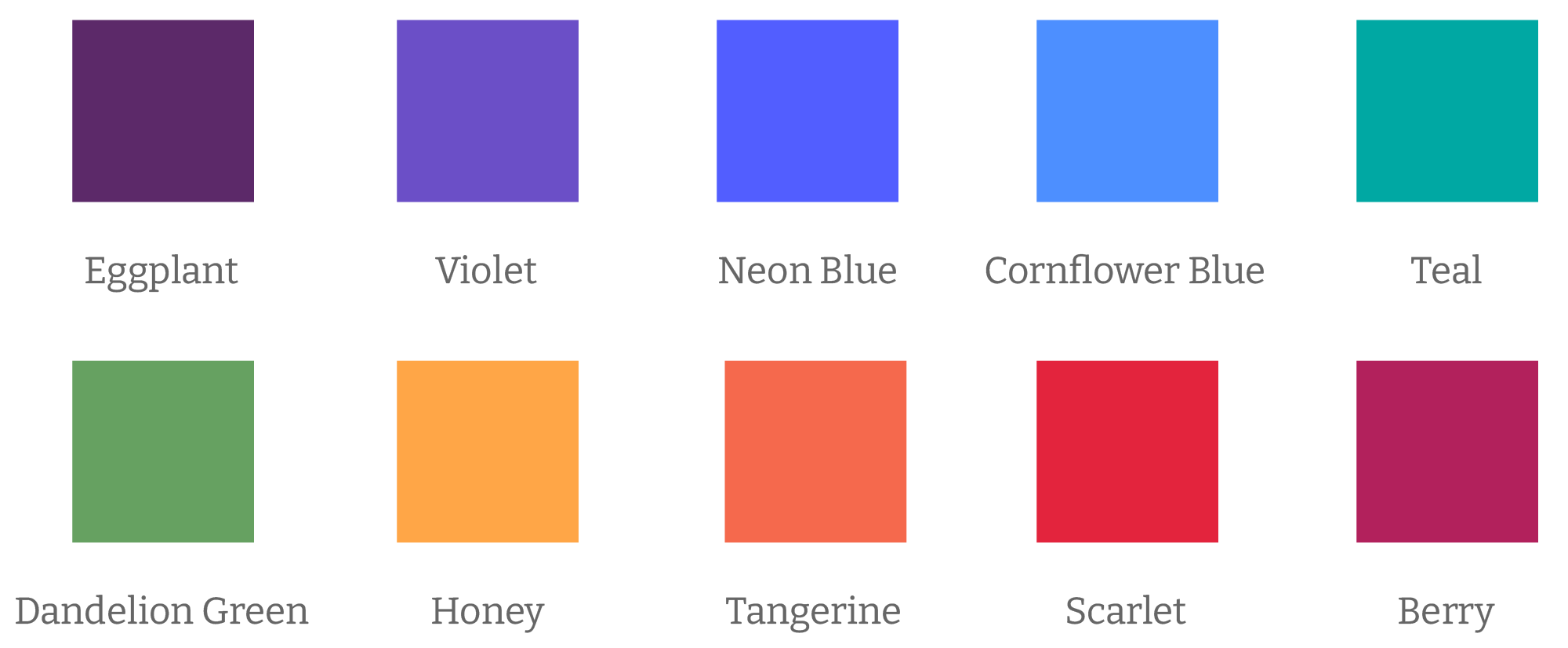
The core brand colors, eggplant purple and tangerine orange, are inspired by the spectacular New Mexico sunsets, and designed to connect with the core audience: family healthcare decision makers. This audience skews toward women with dependent children or grandchildren. The inclusion of other swatches allows us to pivot to appeal to audiences which may not be in-line with the general brand demographic.
Though it is atypical for a brand to contain an arsenal of colors, each swatch has found purpose, allowing campaigns and graphics feeling unique and fresh, but cohesive. Each swatch has two tints and two shades. The expression of this branding is present in all my work with the agency.